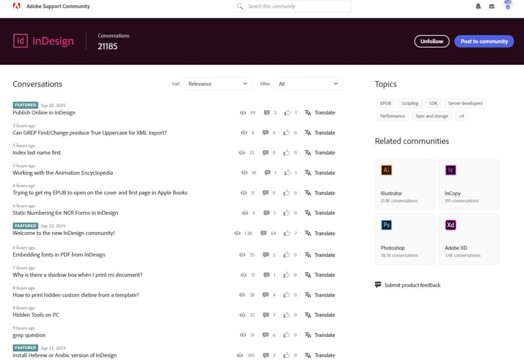
If you find the new Adobe Forums design incredibly wasteful with screen real estate, you’re not alone!
Here’s what it looks like to date:

I played around with the CSS a little, and created instead a “compact” version. Much better! This is what it looks like:

I uploaded this new CSS here, so feel free to use and share around. It only works for the main forum page, not for the messages and threads themselves, but still, you get 5 or 10 times more messages per page!
https://userstyles.org/styles/176003/adobe-forums-compact-css

Frans vd Geest
October 4, 2019 1:00 pmDoes not do anythinh here with Stylish and Firefox 69.02 Dutch…
Ariel
October 4, 2019 1:11 pmHi Frans,
Works ok for me with Firefox on a Macbook. But I’m using Stylus rather than Stylish (couldn’t get Stylish to install for some reason). I’ll try on Windows a little later, but I don’t see how it can not work TBH.
Ariel